In 1972 Kohn resigned his positions as Professor and Director of the Graphics Workshop at Chicago’s Institute of Design, where he had taught for twenty-two years, and accepted a teaching position at California State University-Hayward (now California State University-East Bay). This personal relocation caused a professional upheaval for Kohn that proved invigorating for his work. Building a new, light-filled studio on a flower-bedecked hillside, the contrast with his basement fluorescent-lit Chicago studio infused his work with a radical new direction. “Looking at Kohn’s California prints,” Brooklyn Museum curator Gene Baro wrote in 1981, “can be like opening the shutters on a brilliant morning, when the whole scene is energized, articulated, and dissolved in the vibrancy of air and light. At such a moment, one…yields to the sensation of being.”
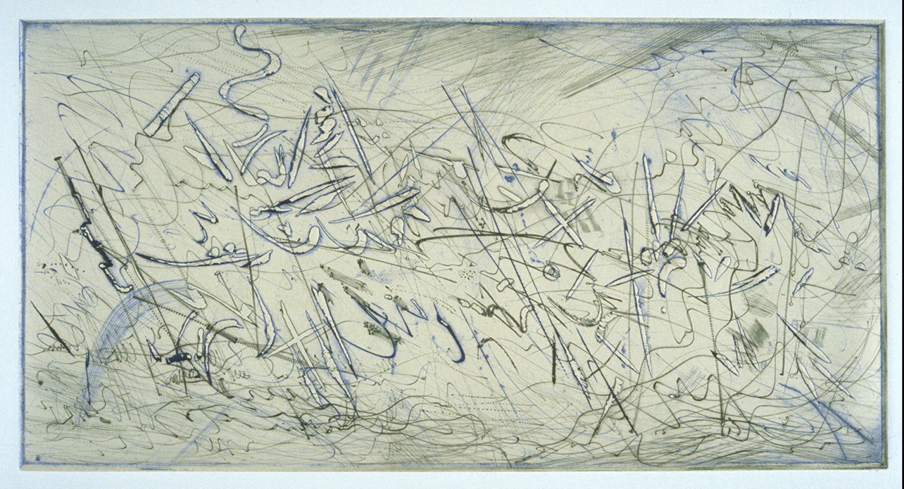
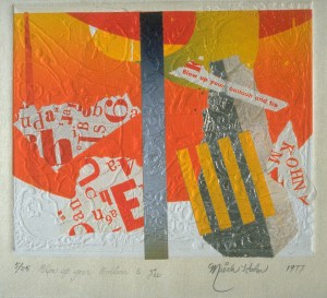
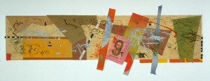
 Pendulum II, 1973. Rainbow-roll color woodcut, chine collé
Soon after moving to California, Kohn met Garner Tullis, founder of the Institute for Experimental Printmaking in nearby Santa Cruz, and learned from him to make handmade paper; the irregular, textural qualities of these papers made an ideal surface for the kinds of new prints Kohn was envisioning.
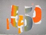
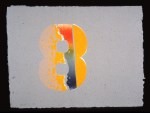
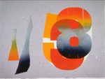
And although Kohn periodically continued to produce figurative or representational images, for the most part his work had by this time become completely abstract. Pursuing the visual properties of our alphabet and numerical systems, he began incorporating symbols and calligraphic notations from his earlier prints: letters, tickets, personal memorabilia, wine and food labels, maps, train schedules, and diagrams from old textbooks. He delighted in viewing things from a fresh perspective, placing common objects or images in a new context in order to force the focus onto the visual impression rather than the informational content of the found objects. “I change them…take them away from their context,” Kohn said. “If I do a good job, when I get through with them, they’re brand new.”

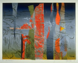

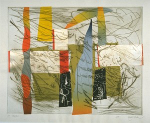
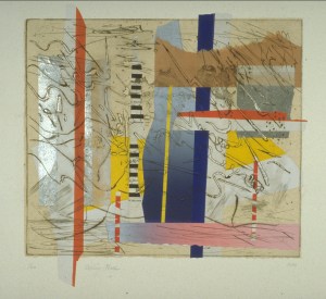
His technical virtuosity by then afforded him complete freedom in structuring his compositions: from the mid-1970s on, a single print might include engraving, aquatint etching, woodcut, and chine collé, printed on a finely embedded or fused piece of handmade paper. Unbound by academic or traditional conventions, feeling free to utilize whatever he needed to achieve the results he desired, Kohn valued the distinctive effects he was able to achieve with the different media and tools. In 1987 Kohn also began to explore embedding sections of colored handmade and Asian papers into the paper pulp itself, fusing and layering transparent strata. This resulted in a complex printing surface that, more than ever before, became an inherent component of the composition rather than simply a passive substructure, enhancing the radiance of the work as well as its visual tension. Although many reviewers were awed by the complexity of the processes he utilized, art critic Kenneth Baker advised that we should be content to “take them for what they most consistently are, little miracles of skill and compositional grace.”

Note: This text is excerpted from the comprehensive book Misch Kohn: Beyond the Tradition by Jo Farb Hernández (Monterey Museum of Art and Harry N. Abrams, Inc., 1997), which includes a full catalogue raisonné of the prints as well as an exhibition history, chronology, list of works in public collections, prize list, and bibliography.
